When teams talk about performance testing, the focus often goes straight to the number: how many users can the system handle? But that number, on its own, means very little. A system that “survives” 1,000 or even 50,000 users doesn’t tell you when performance began to degrade, how errors surfaced, or whether the application recovered after pressure dropped.
What matters just as much (and often more), is how that load is applied. The shape of the traffic you generate during a test, known as the load curve, determines whether you walk away with a binary pass/fail or with real engineering insight. A poorly chosen curve will only tell you “yes, the site stayed up” or “no, it crashed.” A well-structured curve, by contrast, reveals thresholds, bottlenecks, and resilience: where cracks first appear, how quickly they spread, and whether the system bounces back once demand subsides.
This is why the load curve is as important as the size of the test. A blunt ramp to a big number might look impressive on a chart, but it hides the story behind the result. Thoughtful curves expose the real behavior of your application under stress, pinpointing weaknesses before your users do and giving your team the insight needed to strengthen performance where it matters most.
What is a Load Curve?
A load curve is the progression of traffic over time. Instead of focusing on the total number of virtual users, think of it as a gradation or queue that represents how people actually arrive and interact with your system. Performance engineers often distinguish between concurrency (users at once) and throughput (transactions per second), since both shape system behavior differently.
- How quickly do users ramp up? A trickle feels different from a flood.
- Do they arrive steadily, or in bursts? Different curves expose different risks.
- Do you pause at certain levels to observe stability? These plateaus can reveal subtle cracks.
- Do you hold at peak load, or release traffic just as quickly as you applied it? Real world demand often involves both.
This is the real value of shaping the curve: it’s not just about reaching the maximum load, but about watching how the system behaves at each stage along the way.
Concurrency alone doesn’t explain the story. Two tests both claiming “1,000 concurrent users” can look radically different. One might be a smooth ramp that tells you only whether the site stood up at the end. The other might be a staircase of increments that reveals exactly where latency rose, where error rates began, and at what level your infrastructure buckled.
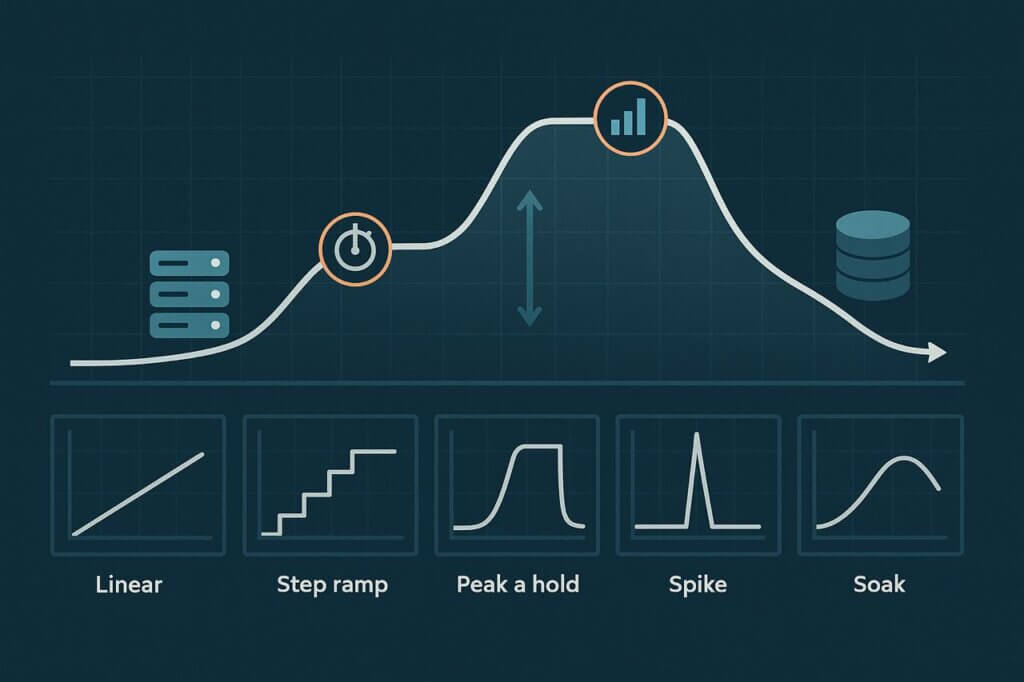
Common Load Curves in Performance Testing
Different load curves exist for a reason: each uncovers a different kind of weakness. Let’s walk through the most widely used models.
Linear Ramp-Up
The simplest test. Virtual users are added steadily until the target is reached. This curve is easy to set up and useful for warmups, but it is also the least informative. All you learn is whether the system withstood the full load. You don’t see when things started going wrong, only whether they were wrong by the end.
Step Ramp (Staircase)
A more thoughtful approach. Traffic rises in increments, with pauses at each step. These plateaus are observation windows: the moments when latency, errors, and resource usage stabilize so you can pinpoint exactly when performance starts to degrade. Did the cracks show at 10 users? 60? 90? The staircase exposes the thresholds that a linear ramp might not.
Peak and Hold
Here, traffic ramps to a target and stays there. It’s less about finding the crash point and more about seeing whether your system can sustain pressure once it hits a steady state. This curve is invaluable for checking autoscaling behavior, connection pool tuning, or whether downstream services can handle constant stress.
Spike Testing
Not all failures are slow burns. Sometimes, traffic arrives all at once. A spike test simulates those surges—a product launch, a Black Friday sale, or a viral social media moment. You discover how well your platform absorbs sudden impact and whether it gracefully recovers once the rush subsides.
Soak / Endurance Testing
Short tests miss the problems that only appear after hours of load. A soak test runs at moderate intensity over long durations. This is how you uncover memory leaks, resource exhaustion, creeping latency, and instability that builds gradually. For critical financial, SaaS, or government platforms, soak testing is often where the most serious reliability flaws reveal themselves.
Why the Simplest Load Curve is Often the Worst
It’s tempting to start with a smooth linear ramp. It looks neat, is easy to configure, and produces a nice round result: the maximum number of users your system handled before failing. But neat isn’t the same as useful.
The problem is that a steep linear ramp hides critical detail. Did performance begin to slip at 200 users but collapse at 800? Did latency creep upward step by step long before errors appeared? Many teams have learned the hard way that relying only on this curve leaves them blind to early warning signs.
If you run a blunt ramp, you won’t know. You’ll be left with a binary answer. You’d know, yes it survived, or no it crashed, and have little insight into why. That might be enough for a quick demo, but it’s worthless for engineering decisions and dangerous in production.
How to Choose the Right Curve for Your Goals
There isn’t one curve that works best in every situation. The right choice comes down to the kind of flaws you’re trying to expose and the insights you want from the test. A thoughtful match between curve and objective is what separates useful performance testing from pretty but meaningless charts.
For capacity discovery, step ramps are the most revealing. By holding steady at each plateau, you can watch metrics settle and identify the exact point where response times first bend or error rates begin creeping up. That precision makes it easier to trace issues to specific components—whether it’s a saturated database, an overwhelmed cache, or exhausted thread pools.
When testing resilience under stress, spike and peak-and-hold curves are invaluable. A sudden spike shows whether your system can handle an unexpected surge without cascading failures. The peak-and-hold reveals how your system behaves once it hits a steady but elevated load: do auto-scalers respond in time, does performance stabilize, or does the platform slowly collapse?
For long term reliability, nothing beats a soak test. Problems like memory leaks, queue buildup, and creeping latency don’t surface in short runs. Holding moderate traffic over hours or an entire business day shows whether your system can endure the slow grind of real-world usage.
The principle is simple: choose the curve that aligns with the risk you most need to understand. Anything else produces data that looks impressive but doesn’t actually help your team improve reliability.
Practical Tips for Designing Load Curves
Picking the right curve is only half the job—the other half is shaping it properly. Poorly designed tests can waste hours and mask thresholds, while well designed ones act like controlled experiments that explain not just if the system fails, but how and why.
- Ramp speed matters. Too aggressive and you’ll overshoot the failure threshold without catching it. Too slow and you’ll never hit meaningful load within the window. The best designs balance realism with visibility.
- Let steps stabilize. When you pause at each level, give the system enough time for caches to warm, auto scalers to trigger, and background processes to settle. Otherwise you’re measuring chaos, not steady-state behavior.
- Look beyond outright crashes. Outages are dramatic, but subtle metrics often tell you more: rising p95/p99 latency, creeping error percentages, or CPU and memory approaching saturation. These are early warning signs that let you fix bottlenecks before users notice.
- Keep it lean. More curves aren’t always better. In practice, two or three carefully chosen models, like a step ramp for thresholds and a soak for endurance, deliver most of the actionable insights without overcomplicating your test suite.
Treat your load curves like experiments: designed with intention, run with discipline, and observed for signals that explain not just if the system fails, but how and why.
Example Scenarios
E-Commerce: Black Friday Traffic
Retail platforms live and die by performance during events like Black Friday. Traffic doesn’t build slowly—it surges the moment sales go live. A spike test shows whether the site can survive the flood, while a peak-and-hold validates whether checkout flows remain stable as high demand continues for hours.
SaaS Platforms: Onboarding Spikes
When a new product launches or a large customer signs on, onboarding can overwhelm shared services like authentication or databases. A step ramp highlights the concurrency threshold where these services begin to degrade, giving engineers evidence to shore up weak points before customers feel the pain.
Financial Systems: Trading Hours
Trading platforms and financial apps must remain stable across long sessions. A soak test across market hours reveals slow-moving failures like memory leaks, queue buildup, and latency creep that short tests can’t expose. These issues may not crash the system outright but can quietly erode reliability.
Media & Entertainment: Live Streaming Events
Streaming platforms often see a steady buildup followed by a sharp surge as events start. A hybrid curve such as a staircase ramp into a spike, shows whether the video infrastructure can handle both the warm up and the sudden crush of last minute viewers without degrading stream quality.
Government & Public Services: Deadline Surges
Tax portals, permit systems, and benefit applications often face deadline driven surges. A step ramp combined with peak and hold reveals whether systems can handle days of steadily rising load and stay usable when traffic peaks just before the cutoff.
Conclusion
The shape of your test is as important as the size. A poorly designed curve might give you a cool headline like “we handled 10,000 users,” but it won’t show you where the system really began to crack or how users were impacted.
Good load curves provide more than bragging rights. They reveal thresholds, pinpoint bottlenecks, and show whether your system can recover gracefully once stress passes. This is why performance engineers treat curve design as experiment setup—not decoration.
So don’t treat the curve as an afterthought. Treat it as the instrument of your test. Choose curves deliberately, match them to your questions, and you’ll end up with results that actually improve performance rather than just meaningless achievement in a report.